Balance Theme


This theme utilizes the latest features of the fast and slick Warp theme framework. It comes with a broad range of layout and module variations as well as a neat typography to style your content. Read on to learn more about this theme and its features:
We provide demo packages with the theme sample data for Joomla and WordPress to get you started right.
Sliced and editable Adobe Fireworks image source files are available to customize the theme easily.
We provide different style variations of the default theme. In addition to these styles we added several other style settings like colors and fonts. Combining the different style options allows you to create your own unique theme design.
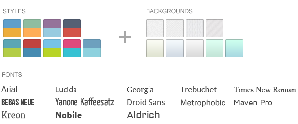
We created some nice theme profiles using the different styles, colors and fonts, you can choose from in the theme administration. You can create your own profiles and even assign them to different menu items. Click on one of the profile images to load it.








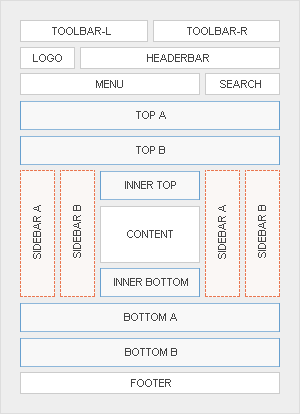
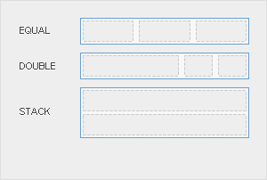
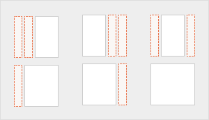
This theme comes with the default Warp6 module layout. The blue module positions allow to choose a module layout which defines the module alignment and proportions: equal, double or stack. You can easily add your own module layouts. The two available sidebars, highlighted in red, can be switched to the left or right side and their widths can easily be set in the theme administration. For modules in the blue and red positions you can choose different module styles. Take a look at the module variations page to get an overview.
The Balance theme comes with some additional features.
We created two custom styles for our Widgetkit Slideshow, perfectly fitting to the theme. To apply the styles, follow these steps:
As a little extra, the Balance theme offers a set of social icons. They are easy to add to your content and are part of our editable Adobe Fireworks Image Source Files.
Here is a little code example how to add them:
<ul class="social-icons">
	<li class="twitter"><a href="#"></a></li>
	<li class="googleplus"><a href="#"></a></li>
	<li class="facebook"><a href="#"></a></li>
</ul>
Possible class names are twitter, googleplus, facebook, youtube and flickr.
You can create some beautiful content by using some simple HTML elements. The Warp theme framework offers some neat styles for all HTML elements and a great set of CSS classes to style your content. Basic HTML is very easy to learn and this small guide shows you how to use all styles provided by the Warp framework.
Here is a short demonstration of text-level semanticts. The <p> element creates a new paragraph. It will have some space before and after itself. To turn your text into hypertext just use the <a> element.
You can emphasize text using the <em> element or to imply any extra importance the <strong> element. Highlight text with no semantic meaning using the <mark> element. Markup document changes like inserted or deleted text with the <del> element or <ins> element. To define an abbreviation use the <abbr> element and to define a definition term use the <dfn> element.
Inline quotations can be defined by using the <q> element
.
The <blockquote> element defines a long quotation which also creates a new block by inserting white space before and after the blockquote element.
To define a short inline computer code use the <code> element. For a larger code snippet use the <pre> element which defines preformatted text. It creates a new text block which preserves both spaces and line breaks.
pre {
    margin: 15px 0;
    padding: 10px;
    font-family: "Courier New", Courier, monospace;
    font-size: 12px;
    line-height: 18px;
    white-space: pre-wrap;
}
Use the <small> element for side comments and small print.
Here is a short demonstration of all style related CSS classes provided by the Warp framework.
Drop caps are the first letter of a paragraph which are displayed bigger than the rest of the text. You can create a drop cap using the CSS class dropcap. To emphasize text with some small boxes use <em> element with the CSS class box.
box-content.box-note.box-info.box-warning.box-hint.box-download.Use the CSS class dotted to create a dotted horizontal rule.
Create a zebra stripped table using using the CSS class zebra.
| Table Heading | Table Heading | Table Heading |
|---|---|---|
| Table Footer | Table Footer | Table Footer |
| Table Data | Table Data | Data Centered |
| Data Bold | Table Data | Data Centered |
| Table Data | Table Data | Data Centered |
Create a nice looking definition list separated with a line by using the CSS class separator.
Create a clearly arranged form layout with fieldset boxes using the CSS class box.
YOOtheme is a well-known template and extension provider for Joomla and WordPress who helps you to create professional websites. But to make your website or interface design a real eye-catcher we had one thing missing: Icons! Icons are an essential tool to simplify user interfaces and today almost every major website uses icons to highlight important parts in their content.
This is why we created a great resource of beautiful and handcrafted icons for web and print projects. We got commercial icon sets including e-commerce, community, file and folder icons and many more as well as many freebies.
As a member of our icon club you will get access to hundreds of handcrafted and detailed icons. New icon sets are added continuously!